 |
| Mike Salbato |
A refreshed design, new features, and an all-new Search tool!
02.19.15 - 1:46 AM
Most of you probably know me as that guy who writes about Final Fantasy XIV too much. And I am! But around RPGFan, first and foremost, I'm our Creative Director. You see my typical work whether you know it or not — every graphic on the front page, all manner of unique layouts like on our recent feature-heavy week, and more. More than that, I've been spending a ton of time on... something I can't talk about yet. There are some amazing things coming to RPGFan in 2015, and I, along with the rest of the staff, cannot wait to show you.
But I can't. Not yet.
What I have done in the meantime was tackle some overdue issues I've had with our layout, which falls into three categories:
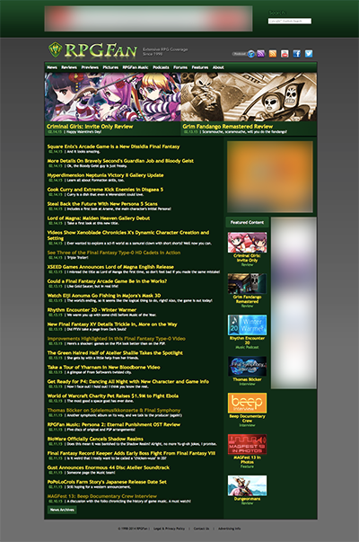
This isn't a full-on redesign, but the RPGFan you saw until today was designed years ago, and it was due for an update, particularly the header area. I love a good embossed logo as much as the next guy, but design aesthetics have changed a lot in the last several years, and there's a reason there's an overwhelming shift towards simpler, cleaner design: legibility, simplicity, and the sheer variety of screen sizes that we use to view content chief among them.
As such, we're sporting a sharper, bolder RPGFan logo (that you've seen already on our social media presences). It's cleaner, easier to read, and from a design perspective, doesn't scream, "hey man, I love Photoshop layer effects." Our navbar is brighter and more prominent, thanks to a larger font and a new color scheme. Our Social Links in the upper right are more prominent and simplistic, as well.
Finally, now that we're on episode 20 of Rhythm Encounter, our other podcast deserved some love. Cramming even more icons into the old header wasn't going to work, so if you look to your right, next to Featured Content, we now have a whole block dedicated to RSS feeds and direct links to our podcasts on iTunes. Bet you didn't know we had Review and Media-specific RSS feeds, did you? Now, you can subscribe to all of our updates via RSS, or just specific types.
Yes, we know our embedded Google search was terrible. When we first implemented the tool, it was good enough, and better than not having a search at all. But as Google phased out that particular system, our own search was... less than great. Don't even ask me what was up with those weird pink buttons.
I'm sorry it took as long as it did, but we have a completely new search now. Not only does it seem to return much better results in our tests, but it appears over the page you're viewing, instead of taking you away from it. Even better: via the tabs at the top of your results, you can now run a Google image search on RPGFan! And all without those awful pink buttons.
This is just the beginning of what's to come to RPGFan this year. There's some really big things in the works, and I will have a veritable novel to write when we launch what's next. Until then, I hope you enjoy these smaller Quality of Life improvements, and continue coming to us for all your RPGFan news and reviews. Between the big stuff coming that I have to be vague about, our staff continues to churn out plenty of content; not only reviews like they always do, but have you noticed all of our new News Editors? Over the last three months, they have been an unbelievable asset to the team, and they've helped make the site better than ever. They all write so much, so please drop them a line and let them know you appreciate their work if you've been enjoying the higher news output.
Okay, okay, they're telling me my time is up, so I'll just leave you with an image of RPGFan That Was for comparison's sake (click for full size):
P.S. If anything appears to not look correct to you, try emptying your cache and reloading; that should fix it.
![]()
