 |
| Mike Salbato |
More than mere aesthetics, we have some new functionality you're sure to love. Come see what's new!
03.05.11 - 11:24 PM
When we debuted our current layout in May of 2009, it was the biggest layout overhaul in the site's history. Moving navigation to the top of the page, an increased visibility of high profile updates, built-in search and several other refinements to layout across the site.
As you've certainly seen, we've been rolling out new layouts slowly over several months: In fall 2010 we debuted our new gallery format that delivered much more content with fewer clicks (we upped the screens per page from 24 to 60, if you're counting), larger thumbnails, a new header image for each game, and on some games, video. The new look has several backend improvements that allow us to get media to you more quickly, as well, so it's been quite successful. Along with the galleries themselves, we've greatly streamlined the gallery listings, too, along with implementing new page headers describing the current page. You probably noticed the PC Pictures page didn't match until quite recently: This page was finally updated, as it required some updates to old content. So if you stumble across an old game in the new format, that's why.
Earlier this year, we followed up with a brand-new preview and review format. These were accompanied with larger thumbs, the same header style, new fonts, a brighter color palette, and what's internally our favorite new feature, a highlighted quote at the top of the article, best seen in Kim's Ar tonelico Qoga preview. Reviews got even more love, with a brand new Scorecard section highlighting a game's best and worst points, a snazzy updated Grading Scale, and a new look for our RPGFan Editor's Choice award, given only to the best of the best.
Much like the streamlined gallery listings, we recently overhauled the review and preview listings to not only match visually, but be easier to read.
So that's what we've done already. What's new today? As you can already tell, we brightened up the site background just a little, to bring some contrast with the page content. We've also gone site-wide with the font changes already seen in the other layout changes, so everything matches now. The Google-based site search has not only moved, but now displays results in a much more pleasing format.
Our review listings have recently seen a facelift, as well as some visual cues for certain things: Import reviews are now merged with domestic, and marked with a special icon, and we've similarly icon-ed XBLA Indie Games and PSone Classic releases on PSN. For us Mac users out there, the PC review page now has an icon denoting games that were also released for Mac. Like Pictures, each page now finally has a header reminding you what section you're in; sorry it took so long to bring those back.
Thanks mostly to our chief news and social media editor Liz, we've greatly expanded outside of the confines of our site and have a strong presence on Facebook, Twitter and YouTube now. To reflect this, we've added a link to the RPGFan YouTube channel (go and subscribe!), and made all of these 'social links' (we love Shin Megami Tensei here) more prominent in the site's header. As you can see, we also have a direct link to iTunes for our Random Encounter podcast, in addition to the RSS feed we already had.
What's possibly the best new part of this update for many of you is a subtle new feature on our review and preview listings: These lists are finally sortable. Go ahead, try any of the review pages and click on any of the column headers to sort the list accordingly. Finally, there's an easy way to browse each platform's reviews sorted by date, score, and, if you have a favorite author, that too. One small bonus is the ability to sort by platform on the Preview and iOS Reviews page. We think this is going to make a lot of people happy, so we're excited to bring this to you. If you're as in love with this feature as we are, be sure to send Dave a thank you note for making this happen.
Currently, these sortable lists and updated layouts are available on the 'Current Generation' platforms in Reviews. We'll be rolling the features out to the older platforms in time, as well as other sections of the site, such as Release Dates.
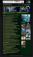
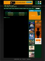
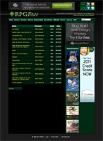
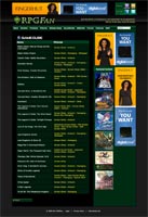
We grabbed a few screen shots of the site 'before' for those interested in a little before & after comparison (click for full size):
That about sums up the changes for now. We always have more things in store, but we hope you enjoy what we've done so far. Even if some of these changes are minor, they all combine Power Rangers-style for what we feel is a stronger and more useful site experience. Thanks for reading! Now go sort some review tables.
(If any of these changes aren't showing up for you, or things look odd, you may have an overactive browser cache, so we suggest reloading the site a few times, and/or clearing your cache.)
![]()


